
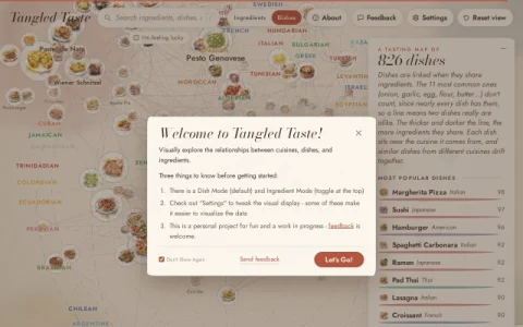
Tangled Taste presents food as a network rather than a list. Ingredients, dishes, and cuisines sit on a single interactive map, and the connections between them are drawn from what they actually share — two ingredients linked by the dishes they have in common, two dishes linked by overlapping components. The result is a browsable picture of culinary overlap that rewards wandering rather than searching for something specific.
The core interaction is selection. Choosing an item highlights its relationships and thickens the links that are strongest, so you can see at a glance which pairings are incidental and which are structural. A dedicated control adjusts how much of the background map is drawn, keeping the most common ingredients and strongest connections visible while trimming the rest; whatever you have selected stays on screen regardless of density.
Visual customization goes further than most graph tools. Illustrations can be switched between watercolor food paintings and plain colored dots, cuisine names and country paintings can be toggled on the map, and common ingredients can be scaled up or normalized to a single size. Globe line intensity ranges from a full earth with translucent continents and borders down to nothing at all.
It is aimed at people who enjoy thinking about food structurally: home cooks looking for unexpected pairings, food writers tracing how ingredients travel between cuisines, and anyone who likes data visualizations with a hand-drawn aesthetic.



Reacties & beoordelingen
0Nog geen reacties. Wees de eerste die een beoordeling geeft.